Coding for Flip Box
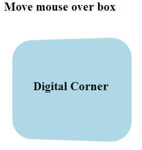
Flip Box Below coding shows the flip box using hover: <html> <head> <style> .flip{ width:240px; height:200px; margin:10px; border-radius:20px;} .flip > .front{ position:absolute; transform: perspective( 600px ) rotateY( 0deg ); background:lightblue; width:240px; height:200px; border-radius: 40px; backface-visibility: hidden; transition: transform .5s linear 0s; } .flip > .back{ position:absolute; transform: perspective( 600px ) rotateY( 180deg ); background: brown; width:240px; height:200px; border-radius: 40px; backface-visibility: hidden; transition: transform .5s linear 0s; } .flip:hover > .front{ transform: perspective( 600px ) rotateY( -180deg ); } .flip:hover > .back{ transform: perspective( 600px ) rotateY( 0deg ); } </style> </head> <body> <h2>Move mouse over box</h2><br> <div class="flip"> <div class="back"><br><br><...